Final Project: Digital Story

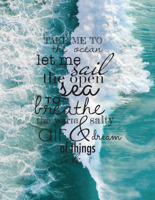
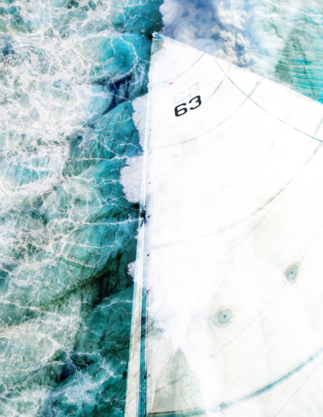
For our final assignment, we created a three minute personal essay story about a topic we are passionate about.  The topic I chose was the ocean/beach. For my video, I inputted a timelapse that was slowed down of the sunset paired with myself and a few friends in the ocean. In the background is the sound of the ocean’s waves in the back of my narration of the story I chose. My story begins with a background on the ocean where I state facts, leading into why the ocean and beach is important to me, ending with a short story of my favorite experience at the beach. 


In my design decisions, I was trying to accomplish a video that was entertaining and engaging for three minutes. I did this by adding sounds in the background to help the audience visualize the experience and the topic I was discussing.


For this project, I did not encounter many problems. This is because the construction of the video was very similar to my commercial that I made for the previous project. One problem I did encounter was that my story was not long enough. I solved this problem by adding more to my story. Another problem I encountered was getting the video from my phone to my computer because for some reason it would not play, so I had to figure out some ways to export the video. I ended up airdropping the video to my friend in the class. She then messaged it over imessage that appeared on my laptop because the video would not play over airdrop or if I downloaded it from google drive. 


For this project, something that was new was exploring background sounds to put in the back of my video. I had never used this before and it was interesting to see the different types of sounds that I could put in the background. 


The part that I enjoyed most about this project was writing the story. I liked researching my topic of the ocean. I also liked how I got to recall all of the memories I have had at the beach. It was nice to reminisce about the past and put it into a video. 


I am most proud of the final product of the video. I like how I was able to slow down the time lapse because it really captures the moments. I also like how I was able to put the sounds of the water in the back along with my voice over of the story. I am proud that I was able to figure out the editing. 


If I had more time, I think I could have written a better story. I could have made the video story longer. I also could have gone out and recorded more footage to put in my video to make it more interesting. 


30 Second Commercial

For this blog, I will be discussing the next assignment I have completed, the 30-second commercial. The main objective of this assignment was to create a 30 second commercial for a non-profit organization or cause. The topic for my commercial was centered around the Breast Cancer Research Foundation. Their mission is to prevent and cure breast cancer by advancing the world’s most promising research. 


To create this commercial, I first began researching the topic and I chose this foundation and topic because breast cancer has had a personal effect on myself and my loved ones. It is important for people to be aware of how prominent breast cancer is in today’s society as well as how important it is to fund research for a cure. Some of the things I researched were the foundations mission and what  they aim to do as an organization. Next, I found images to use for my commercial from their instagram page. I felt that this was the most realistic approach to creating a real commercial because they have images of real scientists and survivors. 


My next step in creating this commercial was creating a storyboard. I set up each panel for five seconds, making six panels for the time span of 30 seconds all together. This ended up changing for the reason of putting in more images. I then had to split up a few five second panels to fit extra images in. I then created a script to go along with each of the time panels because I wanted the script and what I was saying to match the images I chose. 


When creating this commercial, there were a few things I kept in mind. I did not want to have one single face for this commercial because I really wanted it to be centered about the researchers and the importance of their work. The “ask”, or the thing I wanted the audience to do was to donate to the foundation to help fund research for a cure. Building up to the ask, I wanted to give a brief background on the foundation because people will not donate to a cause they do not know about. The “lens” I was using was an informational direction. The speaker was myself, or a narrator for the foundation. The subject is funding for breast cancer cure research. The listeners are men and women around the world who are looking to help make a change and find a cure for breast cancer. 


Citations:

Homepage

https://www.instagram.com/bcrfcure/

Music Kiosk

For this project, we were tasked with creating a music kiosk presentation. This means, create a self-timed presentation in Powerpoint using the band we created a poster for. In the presentation, we had to have a few elements that were required. These elements include:  


  • Soundtrack by the artist, in my case Dan + Shay
  • Opening slide with a presentation title, name, and date 
  • Overview slide with 4-5 bullets of interesting information about the artist 
  • Combination image and text slide with album cover, name of album, and tracks
  • Slide with poster 
  • Description of poster and design rationale for poster 
  • Slide with collage of images 


For this project, what I was trying to accomplish was creating a five minute presentation that was self-timed and included all the right elements. I wanted the presentation to be visually appealing while captivating the audience’s attention. I encountered a few problems along the way of creating this presentation. My first problem that I encountered was figuring out how to input a song by Dan + Shay into the powerpoint. I solved this by receiving help from one of my classmates that knew how to input the song. She showed me a step-by-step process on how to download the song and input it into the actual powerpoint so that it would play the whole presentation. The second problem I encountered was trying to upload my video to youtube. The first time I tried to upload the video, it told me that I could not do it. I then went back to try again at a later date and it uploaded correctly. A few things in this project were new to me and also related to the problems I encountered. For example, inputting music into a presentation was new for me and timing the presentation correctly so that I would have enough time on each slide to talk and explain the slide. For this project, what I enjoyed the most was inputting the music into the presentation. I thought this was very interesting because it made the presentation more engaging and fun to present. In relation to this assignment, I was most proud of how I successfully created a presentation with the required elements and presented it on time with the self timer for each slide. If I had more time, I would have added more to the presentation and made the self timer more accurate. 

Here is a link to my self-timed presentation.

Animated Postcard

Font-Poem-01

For this assignment, we used our font poems and ecollage to created an animated GIF postcard. With this design, I wanted to create a GIF that was fun to watch and that also represented the poem. I decided to make the time in between each transition not that long so that the audience would not get bored. I also decided to keep the font poem up the whole time so that the audience could read it. I also like how it does not go away so that the reader does not struggle to read one art at one time before it disappears.

During this project, I faced many challenges. My first problem was that I did not have enough space on my personal macbook pro to add the animation to the font poem and ecollage. This was very frustrating to me because it would not let me edit the design. I solved this problem by bringing the design on a different computer in the lab here at school because there was enough space to work with it.

What I found was new in this project was adding the animations into a design. I had never learned how to do that in photoshop; I did not even know that this was even a feature in photoshop.

What I enjoyed most about the project was creating a collage that lowed easily with my poem and could be made into a GIF. I enjoyed learning new features of photoshop as well.

In relation to this project, I am most proud that despite my obstacles in the beginning with the animations, I found a way to persevere beyond the frustration and find a solution. Usually when I hit a bump in the road with a design, I get frustrated and quit, but not this time.

If I had more time, I would have broken up the text to make the GIF longer. This means that I would have a transition for every line of the font poem. Maybe I would have created a different order for the background images.

Concert Poster

Screen Shot 2019-10-25 at 2.44.38 PM

For this assignment, we were tasked with creating an 11/17 inch concert poster for our favorite band. With my design decisions, I was trying to create a poster advertising the concert for RWU students. I wanted to create a poster that clearly represented who the concert was and the specific details for the concert, as if it was actually taking place. What motivated me to make the design decisions I did was the concept of simple and less is more. Dan + Shay album over designs are always so simple, so I wanted to keep that theme going in my concert poster design. 


One problem I encountered during this process was the layout and positioning for the concert details. I started off with the Helvetica Nueue Font in condensed bold and then moved to a different weight of ultra thin. This made the letters a bit easier to work with and it broke up the text making it different than the title. It also allowed me to play around with the different sizes to create a hierarchy of where and what the audience should look at first. 


Just the concept of creating a concert poster was new for me. I liked getting to design for a band that I love and try to design something that would fit in with their style. 


The thing I enjoyed most about this project was cutting out Dan and Shay and putting them in a design that was simple but fun. I enjoyed making a poster centered around them because I am a  big fan of them. 


In relation to this project, I am most proud of my cutout of Dan and Shay and how I incorporated them into an abstract yet simple design. 


If I had more time, I would have played around with more fonts and different layouts. I also would have created multiple designs with different colors. Hypothetically, if this poster was actually advertising a real concert at RWU, I would have multiple posters printed out with various colors so students wouldn’t get sick of one color. 

Image Source: 


https://www.google.com/url?sa=i&source=images&cd=&ved=2ahUKEwjVvfrfuo3lAhXlc98KHXUdDn8QjRx6BAgBEAQ&url=https%3A%2F%2Fwww.soundslikenashville.com%2Fmusic%2Fdan-shay-times-square-dick-clark-2019%2F&psig=AOvVaw2N0w_3uCK2Ml2ZeB0ecSvq&ust=1570651430081209

E-Collage

Font Poem 01

For this week’s assignment, I was tasked with creating an e-collage in Photoshop that would go along with the theme of my font poem. I found my images on various websites that are cited below. While creating my collage, I kept in mind what I saw trying to accomplish: creating a collage in which I would be able to see aspects of each photo I used. 


Some challenges I encountered during this assignment were finding pictures to use that would work well together. I solved this problem by figuring out how to layer specific pictures in a certain way and choosing pictures that would work well being layered. 


During this assignment, I worked with various different overlays and filters to obtain the right layout. I previously had not worked with this specific tool in photoshop that often,  which was new for me. 


What I enjoyed the most about this project was continuing to explore photoshop and the different overlays I could use to create a specific effect. I also liked seeing the outcome of what you can do with layering images. 


In relation to this project, I am most proud of how I did not just stick to one filter on each image. I explored all filters and different ways to layer each image so that I could create the best effect. 


If I had more time, I would explore more image options and different ways to layer each image as well as the filters and overlays. I would also try to cut out special parts of other images to incorporate into my designs. 


Images Citations:

https://unsplash.com/photos/uQqNvGDRjjg

https://www.billboard.com/articles/news/dance/8474727/best-songs-about-ocean-sea

https://unsplash.com/photos/vRTvgwXiurA

Font Poem

Screen Shot 2019-09-20 at 2.33.23 PM.png

I chose this particular poem because I love anything to do with the ocean. It is a very descriptive poem, which allows me to imagine myself on a sailboat on the ocean feeling the warm and salty air against my skin as the wind blows and being free.


Here are the fonts I used:

Fredericka the Great

Dawning of a New Day

American Typewriter

Mr De Haviland

Didot

Sacramento

Copperplate

Poiret One

Futura


I chose these fonts because I felt as though they needed to be very free and natural fonts, such as handwritten fonts. The words that are more static like “to” and “the” needed more regular and basic fonts because they are words that aren’t as important. The other words like, “dream”, “breathe,” and, “sail,” needed the handwritten fonts because they are the more important words that will inflict the certain feeling when you see and read them. 


I arranged the words the way I did because I felt as though it was easy to read without all the words being overwhelming to read in one paragraph. Some words were bigger than others and on different lines due to the way you would read the poem. 


I did not encounter many problems when creating my poem. One problem was that I created an initial layout of the poem, but forgot to save it. As a result, I had to redo the entire layout and I actually used that opportunity to explore more fonts. 


I am most proud of how the poem looks. I think it is very aesthetically pleasing and the fonts work very well together. 


If I had more time, I would have tried to explore more fonts and other arrangements for the words. 


Contact Sheet

final contact sheet

This semester, Digital Communications is one of the courses I am taking that requires me to complete projects and post on my WordPress blog site. The first assignment we completed was the Contact Sheet, pictured above. The contact sheet is a combination of different photos in the form of a proof sheet used by photographers. The rows of different images were used to show the differences between different shots. The rows were separated by image editing techniques: Resolution, Format/Mode, Orientation, Framing, Content, and Purpose.


Making design decisions, the goal I was trying to accomplish was to show the differences between each image after editing. For example, the first row represented the image editing technique of resolution. Resolution is measured in dots per inch (dpi), which was changed from 72 dpi to 300 dpi to 600 dpi to 1200 dpi. My goal was to edit each picture to show the differences in dpi between each image.


I faced a few challenges throughout the course of this project. One problem I faced was figuring out how to create a wide angle. I have never done it before, so I was confused on how to do it. I solved this problem by asking a classmate who knew how to do it. Another problem I encountered was that I did not know how to format an image to duo toned. To solve this problem, I had to explore photoshop a bit and play around with the different tools. I went through the different types of modes to edit an image and I found that after changing the image to greyscale that if you go back to the mode, you can change it to duo toned.


For me, editing an image to be a wide angle was new for me. I ended up changing it to a fish-eye effect but this whole concept was new to me because I did not know how to before. I also learned how to change the resolution and how to edit an image to be duo toned.


In this project, I enjoyed adding the different filters to my image in the purpose row. I enjoyed this part because it was fun to go through all the filters and explore ones that I had never used before. I also enjoyed editing various images that I would not normally edit like this. It gave me a new perspective for different photos, and I liked seeing how just a simple tool can change the whole photo.


In relation to this project, I am most proud of myself for exploring different tools in photoshop and solving problems.  I learned that it is okay to ask for help sometimes when you. Are stuck. I also am proud of myself for learning how to look at photos in different perspectives and being open to new ways of editing.


If I had more time, I would have. Tried to edit my images better and more carefully. I also would have chosen different images to make a similar theme of maybe ocean or landscape images.